Tuesday 1 February 2011

A1 Illustration


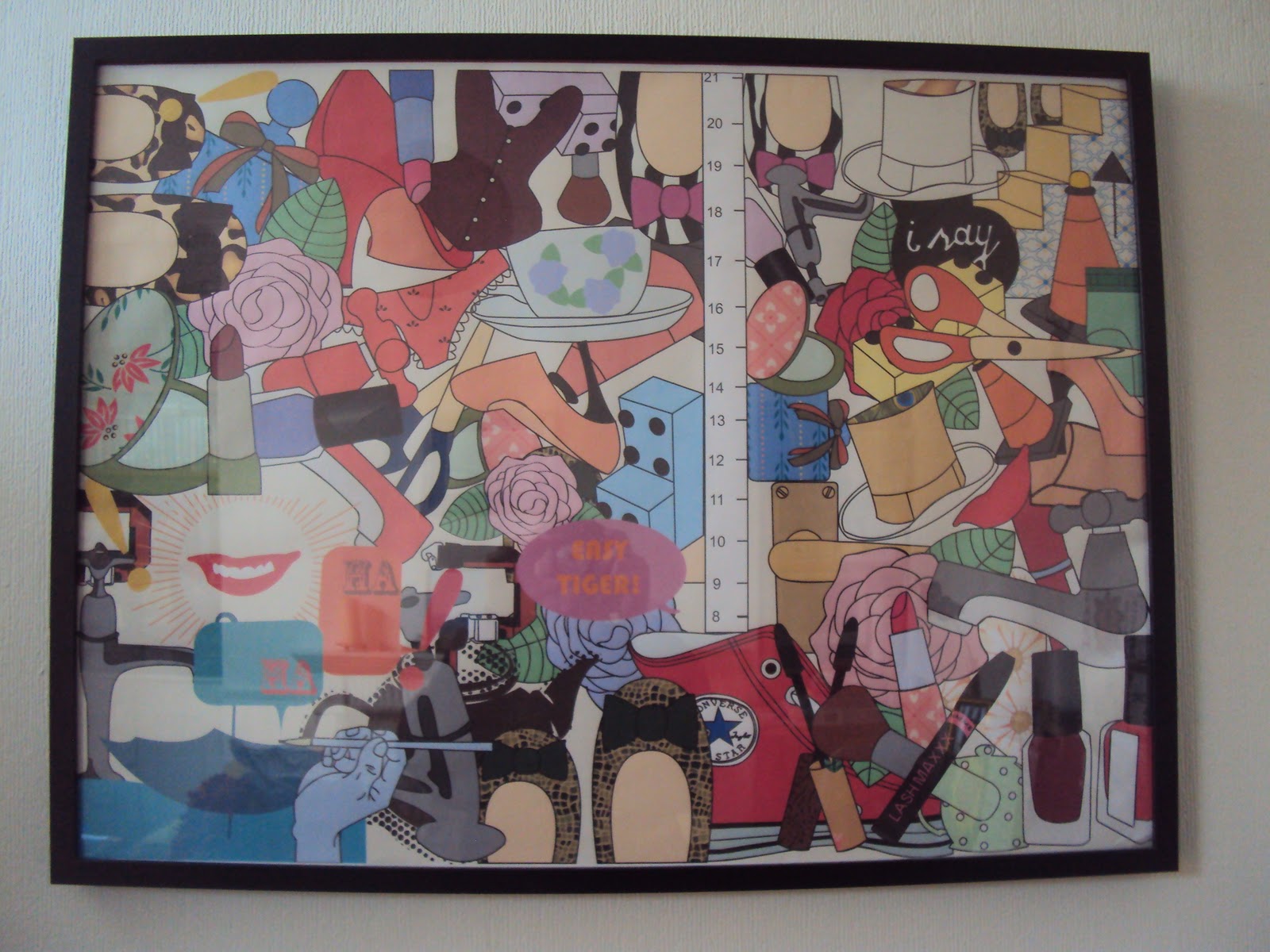
This was my final outcome I produced for the project, Everyday Objects. Throughout the project I had researched into different artists that inspired me to create my own work. I created this piece using Illustrator. I took works of 3 artists and drew them out on Illustrator. I have Victoria Ball's work in the top left, Zoe More Oferall's work in the top right and Willie Ryan's work in the bottom left. On the bottom right is work that I had created myself of my own Everyday Objects. 

I really enjoyed doing this piece as I love using Illustrator and is something I would like to get better at and pursue further. 

Zoe More sketchbook


Z0e More O'ferrall was an artist I covered in the A1 piece. She is an Illustrator who I came across on a website called Illustration Web. Her work has a sketchy look to it, with not much colour and what colour there is, isn't bright and in your face, it's calm but effective.

I made this sketchbook to show her work in it. As the background of the pages was all white, I wanted it to look more interesting. To do this I used different strips of paper and wallpaper and layered them up on the background to make the pages more attractive. 

Zoe More study sheet


This study sheet was for a follow on of the sketchbook above. As I had already used her work in the sketchbook, I wanted to sketch some of her work myself so I decided to make a study sheet out of it. I like drawing in illustrations as I think it is easy to link things in a collage this way as you can intertwine all the images together to make it look effective.

I like working in this way, illustrations on a study sheet, as I think the final product looks effective and busy. When looking into her work, noticing there weren’t much colour, I took this to the study sheet and just used a hint of colour. I used fine liners to do this to give it the same look as the outline of the images. 

Victoria Ball sketchbook


This was another artist that I covered in the A1 illustration piece. I find her work very delicate and it has a real vintage feel to it. I made a sketchbook again to display her work and used different materials and papers to layer up the background. I tried to use colours that complemented her work. When I was putting the pages together, I used sticky foam to back the images of her work to make them stand up off the background.

I really enjoyed doing this sketchbook, as I loved all the various materials and papers I used for the background as I thought they went very well with the theme of her work. This was the favourite sketchbook of mine that I created as I think it has a nice, delicate look to it because all of her work go together nicely as the colours and images are similar. 

Victoria Ball study sheet


This was one of my favourite study sheets that I did. It was for the everyday objects project and goes with the Victoria Ball sketchbook above. As in the past I had done study sheets with just fine liners, I wanted to add lots of colour to this one so decided to use watercolours and coffee. The watercolours blended it all together nicely as the different colours merged into another from another image. The coffee gave it a vintage feel, to match the theme of the sketchbook before.

After working on this piece, I discovered how much I enjoyed using watercolours and how effective it looked as a final outcome. After this, I then went on to use watercolours in more of my artwork.

Kate Sutton final piece


Kate Sutton is one of my favourite illustrators and I based most of my project on her for the project graphic illustration. After researching into her work, I found that the work I favoured of hers and the images that come up a lot in her work is the water, toadstools, knickers and tea sets. Once I’d discovered these, I wanted to bring them to life somehow in my final outcome, not just some illustrations on paper. I got some big pieces of white card and drew water swirls on in the style of Kate Sutton. I then put this in my bath, coming out of the tap so it looked realistic and photographed it. I then did this for the other objects, making them out of card and putting them in different places in my house and garden then photographing them.

This was a really fun final outcome to do as it involved going through a lot of different stages to get the final product. I also enjoyed it, as it was a new way of working and something I hadn’t done before.

Manipulated photographs of Kate Sutton piece


This is a follow on from the final outcome above. I used Photoshop to change the photographs I took for my final piece. I scanned the photographs into Photoshop and using the different effects, lighting and transparency, I changed the photos so they were manipulated and looked different. Some went negative, some only showed an outline of the object and some went really dark, showing a glowing of light coming through.

When doing this, I was surprised how many ways you can change a photograph to make it look nothing like the original. This was a good way of working as it helped me get used to Photoshop, helping me to progress at it in further projects.